The Ontario Curriculum AI identity system
One mark, one palette, one voice — documented so that every future page, post and product surface can be built without a designer in the room.
Brand assets
Download the logo kit
SVG, PNG and favicon files for Canva, slide decks, social profiles, print and merch. Everything is transparent where it should be, sized where it matters.


Primary mark

Horizontal lockup


App icon / avatar

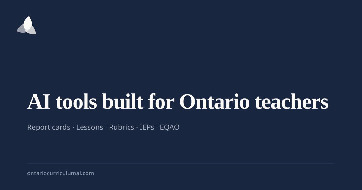
Social starter kit

Favicon package
Multi-resolution .ico plus PNGs for modern browsers, Apple touch icons and PWA manifests.


Phase 1
Brand audit
What the identity was doing before this system, why each item mattered, and what replaced it.
Logo
high- Observed
- The mark shipped as a raster PNG forced through mix-blend-multiply, with a dark-mode invert hack to stay legible.
- Why
- Blend modes fail on non-white surfaces, invert distorts brand colour, and a raster mark degrades on retina, print and embroidery. A brand mark must be resolution-independent and theme-aware by construction.
- Resolved
- Replaced with an SVG logo family that inherits colour from design tokens and needs no blend or filter tricks.
Logo system
high- Observed
- Only one lockup existed. No monogram, app icon, stacked or monochrome variant.
- Why
- Without a defined family, each new surface improvises — that improvisation is what makes a brand read as generic.
- Resolved
- Six sanctioned lockups with clear-space, minimum-size and misuse rules.
Colour
medium- Observed
- Sixteen semantic hues coexist (creative, growth, trust, cta, four frame colours, Ontario red) with no stated hierarchy.
- Why
- Every colour meaning something means no colour means anything. Premium identities restrict the everyday palette and reserve accents for genuine signal.
- Resolved
- Layered the palette into Core, Signal and Domain tiers so the accents survive but stop competing.
Typography
medium- Observed
- Inter plus Source Serif 4 is a sound pairing, but heading sizes are declared ad hoc across pages.
- Why
- An inconsistent scale reads as unfinished even when each page looks fine alone. A fixed scale is what makes unrelated pages feel like one product.
- Resolved
- Locked a seven-step type scale with paired line heights and tracking.
Iconography
medium- Observed
- Lucide icons are used at varying sizes and default stroke weights across tools.
- Why
- Mixed stroke weight is the single most common tell of an assembled rather than designed interface.
- Resolved
- One BrandIcon wrapper enforcing 1.75 stroke and a fixed size ramp, with a named icon per product area.
Illustration
low- Observed
- Empty states rely on a lone tinted icon in a rounded square.
- Why
- Correct restraint, but it carries no brand signature — the same block appears in thousands of shadcn apps.
- Resolved
- Structured UI-preview wireframes plus the trillium geometry as a quiet watermark; no cartoon teachers, no clip art.
Social
high- Observed
- Posts inherit page colour but share no fixed frame, corner mark or typographic signature.
- Why
- Recognition without a logo comes from a repeated frame, not from a repeated colour.
- Resolved
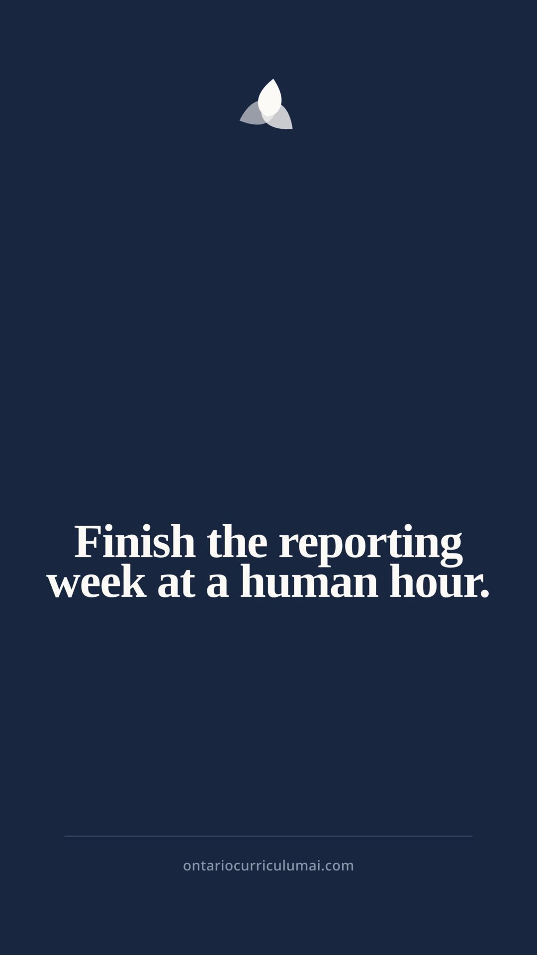
- A single post frame: ink field, trillium corner mark, serif statement, hairline rule, fixed footer.
Product UI
medium- Observed
- Radius, shadow and border treatments vary between marketing sections and tool surfaces.
- Why
- Users move between these constantly; the seam is felt even when it is not consciously seen.
- Resolved
- One elevation ladder and one radius scale applied to both.
Phase 2
Brand personality
The fixed positions every piece of copy is written from.
Mission
Give every Ontario educator back the hours that curriculum paperwork takes, without ever taking away their professional judgment.
Vision
The default professional workspace for Ontario education — trusted by teachers before it is ever mandated by a board.
Promise
Every output is Ontario-specific, Growing Success-aware, and ready for a teacher to make their own.
Positioning
For Ontario educators who are out of hours but not out of standards, Ontario Curriculum AI is the professional workspace that drafts to provincial expectations — because it is built on the Ontario curriculum itself, not on a general-purpose chatbot.
Archetype
The Sage · The Caregiver
Expertise offered as steady support. Never the Magician — we do not perform tricks, and never the Hero — the teacher is the hero.
Values
Professional judgment first
Every output is a draft for a teacher to own. We never imply the AI decides.
Provincially specific
Ontario expectations, Ontario language, Ontario calendar. Specificity is the product.
Privacy without asterisks
No identifiable student data, stated plainly and repeatedly.
Calm over clever
Fewer choices, quieter surfaces, less decoration.
Finish, don't dazzle
We are measured by tasks completed, not features shipped.
Voice
- Canadian English, always — behaviour, programme, centre, recognize.
- Colleague-to-colleague, not vendor-to-buyer.
- Growing Success qualifiers where evidence is graded: some, considerable, thorough.
- Concrete nouns over abstractions: report card comments, not 'content'.
- No AI tells — never delve, tapestry, unlock, revolutionize, game-changing.
Tone by context
- Marketing
- Confident and specific. Name the task and the time it takes back.
- Product UI
- Short, literal, instructional. No exclamation marks.
- Errors
- Plain cause, plain next step, no apology theatre.
- Journal
- Editorial and considered. Longer sentences are allowed here.
- Social
- One idea per post, teacher-first, never hype.
Ontario teachers do not need another AI tool. They need the reporting week to end at a reasonable hour, with comments they would be comfortable reading aloud to a parent. Ontario Curriculum AI began from that one evening — the one every Ontario educator recognizes — and it is built the way that evening asks for it to be built: provincially accurate, quiet, fast, and always handing the final word back to the teacher.
Phase 3
Logo system
The Trillium Aperture — three petals in 3-fold rotational symmetry, each offset nine degrees so the mark reads as an aperture opening. Provincially specific, no education clichés, no AI iconography.
Primary mark
Horizontal lockup
Stacked lockup
App icon
Monogram
Wordmark
Light field
Dark field
Monochrome · print · merch
Clear space
Clear space on all four sides equals the height of one petal (25% of the mark's height). Nothing enters this field — not rules, not text, not container edges.
Minimum sizes
- Digital mark
- 20 px
- Horizontal lockup
- 132 px wide
- Stacked lockup
- 96 px wide
- Favicon / monogram
- 16 px
- Print mark
- 8 mm
- Embroidery
- 22 mm — use the monochrome mark
Never
- Rotating the mark out of its fixed orientation.
- Adding a drop shadow, glow, bevel or gradient fill.
- Recolouring petals to Signal or Domain colours.
- Placing the ink mark on any dark field — use the reversed mark.
- Re-setting the wordmark in another typeface or spacing it manually.
- Enclosing the horizontal lockup in a circle or badge.
Phase 4
Colour system
Three tiers. Core carries the interface, Signal is reserved for action and state, Domain colours never leave their product area.
Core
Carries 90% of every surface. If a design can be made from these alone, it should be.
Ink
#182640 · rgb(24 38 64)
--primary
Headers, primary buttons, the mark, ink-field sections.
Contrast 13.9:1 on Paper
Paper
#FBFAF7 · rgb(251 250 247)
--background
Default page background. Warm, never pure white.
Card
#FFFFFF · rgb(255 255 255)
--card
Raised surfaces against Paper.
Sunken
#F7F4EF · rgb(247 244 239)
--surface-sunken
Recessed panels, previews, alternating bands.
Rule
#E3E5E9 · rgb(227 229 233)
--border
Hairlines only. Never as a fill.
Quiet
#666F7D · rgb(102 111 125)
--muted-foreground
Secondary text, captions, metadata.
Contrast 4.9:1 on Paper
Signal
Reserved for action and state. Never decorative.
Action
#B84D14 · rgb(184 77 20)
--cta
One primary call to action per view. Nothing else.
Contrast 4.6:1 with white
Success
#328062 · rgb(50 128 98)
--success
Saved, generated, complete.
Warning
#99691A · rgb(153 105 26)
--warning
Usage limits, deprecated curriculum versions.
Error
#CE3232 · rgb(206 50 50)
--destructive
Failures and destructive confirmations only.
Information
#1F5FAD · rgb(31 95 173)
--trust
Privacy notices, curriculum citations, compliance.
Domain
Fixed meanings inside a product area. Never reused outside it.
Belonging
#C4562A · rgb(196 86 42)
--frame-belonging
Kindergarten Four Frames.
Self-Regulation
#6A46A8 · rgb(106 70 168)
--frame-selfreg
Kindergarten Four Frames.
Literacy
#1F6DA3 · rgb(31 109 163)
--frame-literacy
Kindergarten Four Frames.
Problem Solving
#2A7A57 · rgb(42 122 87)
--frame-problem
Kindergarten Four Frames.
Ontario Red
#C62828 · rgb(198 40 40)
--ontario-red
Provincial alignment badges only. Never as a UI accent.
Phase 5
Typography
Source Serif 4 for statements, Inter for instruction. Both load already — the system is the scale, not the fonts.
| Step | Font | Size | Leading | Usage |
|---|---|---|---|---|
| Display | Source Serif 4 · 700 | clamp(2.5rem, 2rem + 2.4vw, 3.5rem) | 1.05 | Campaign heroes and print covers only. |
| H1 | Source Serif 4 · 700 | clamp(1.875rem, 1.4rem + 1.6vw, 2.5rem) | 1.12 | One per page. |
| H2 | Source Serif 4 · 600 | clamp(1.25rem, 1.05rem + 0.7vw, 1.625rem) | 1.2 | Section headings. |
| H3 | Inter · 600 | 1.0625rem | 1.35 | Card and subsection titles. |
| Body | Inter · 400 | 1rem | 1.65 | Default reading text. Max 68 characters per line. |
| Small | Inter · 400 | 0.875rem | 1.55 | Dense tool surfaces, table cells. |
| Caption | Inter · 500 | 0.75rem | 1.45 | Metadata, timestamps, disclaimers. |
| Eyebrow | Inter · 600 | 0.6875rem | 1.3 | Uppercase section labels. Never longer than four words. |
- Serif for statements, sans for instruction. A heading that gives an instruction is sans.
- Never set body text below 0.875rem, and never below 1rem on marketing pages.
- Measure caps at 68 characters; editorial long-form caps at 74.
- Two weights maximum in any single composition.
- Numerals are tabular in tables, charts and any figure that changes in place.
- Body text meets 4.5:1; large text and UI edges meet 3:1. No exceptions for brand colour.
Phase 6
Iconography
One icon per product area, permanently, at one stroke weight. An icon here is a name, not a decoration.
- Stroke width 1.75 at every size — never Lucide's 2 default.
- Sizes step 14 / 16 / 20 / 24 only.
- Rounded caps and joins, 2px corner radius equivalent.
- Icons carry meaning or are aria-hidden. Never both decorative and labelled.
- One icon per product area, permanently. An icon is a name, not a decoration.
Phase 7
Illustration system
We illustrate the artefact, never the person making it. No cartoon teachers, no clip art, no mascots.
Structure over character
Show the artefact being produced — a comment block, a rubric grid — not a person producing it.
Wireframe truth
Preview blocks use real proportions from the real output so they teach while they decorate.
Two tones plus ink
Any illustration uses Paper, Sunken and Ink, with at most one Signal accent.
Geometry from the mark
Ambient shapes derive from the trillium's 3-fold symmetry, at low opacity, never as a focal element.
No people, no cartoons
No illustrated teachers, students, mascots, clip art or hand-drawn textures.
Sanctioned treatment
Preview blocks mirror the real proportions of the output they represent, so an empty state teaches the shape of the result before the teacher generates it.
Phase 8
Social media system
Recognition without a logo comes from a repeated frame. Every asset on every platform uses the same 6% margin, corner mark, hairline rule and footer.
Report card season starts in three weeks.
ontariocurriculumai.com
4.5 hrs
Reclaimed per reporting cycle
Median across Ontario teachers.
ontariocurriculumai.com
- 1. Name the expectation first.
- 2. Cite the evidence you saw.
- 3. Give one next step.
ontariocurriculumai.com
Template library
- Announcement
- Ink field · trillium corner mark · serif statement at Display · hairline rule · handle footer.
- New feature
- Paper field · product frame at 60% · Action pill label · one-sentence benefit.
- Teaching tip
- Sunken field · numbered serif list · no imagery · caption-sized source line.
- Teacher quote
- Ink field · oversized serif quote · attribution in Eyebrow · mark bottom-right.
- Journal article
- Split field · category Eyebrow · serif title · reading time caption.
- Statistic
- Single tabular figure at Display · Quiet supporting clause · Action underline rule.
- Carousel
- Slide 1 statement, slides 2–n one idea each, final slide CTA. Frame identical on every slide.
- Reel / Story cover
- 9:16 ink field · statement top-aligned · mark bottom-centre · safe margins 12%.
- YouTube thumbnail
- 16:9 · maximum six words · serif · Action underline · mark top-left, never centred.
- Profile banner
- Ink field · stacked lockup left · single positioning line · no feature list.
- Holiday / seasonal
- Ontario calendar reference only. Sunken field, no confetti, no seasonal illustration.
Invariants
- The frame never changes: 6% margin, hairline rule, mark in a fixed corner.
- One idea per asset. If it needs two, it is two assets.
- Serif for the statement, sans for everything else — on every platform.
- Never place text over a photograph.
- The handle sits in the same position on every asset, at Caption size.
Applies identically to Instagram, Facebook, TikTok, LinkedIn, YouTube, Threads, X and Pinterest. Only the crop changes.
Phase 9
Marketing graphics
Reusable components, so a campaign page never needs bespoke styling.
Report card comments
Growing Success language, Achievement Chart aware, ready for your own edits.
Four Frames documentation
Voice capture to pedagogical story, mapped to the Kindergarten Program.
IEP goal drafting
Measurable goals structured for Regulation 181/98 review.
5,000+
Curriculum expectations indexed
Kindergarten through Grade 12.
It gives me a draft I would actually be comfortable reading aloud at an interview night.
Phase 10 & 11
Application and guidelines
The rules that keep every page, modal, empty state, chart and tooltip speaking the same language.
Do
- Give the mark clear space equal to the height of one petal on all sides.
- Use one Action colour per screen.
- Let sections breathe at the section rhythm rather than filling space.
- State privacy and professional-judgment notices in plain sentences.
- Name the Ontario document you are aligned to.
Don't
- Do not recolour, rotate, outline, or add effects to the mark.
- Do not place the mark on a busy photograph or a Signal colour.
- Do not stretch the lockup or re-typeset the wordmark.
- Do not use Domain colours as general UI accents.
- Do not use stock photography of classrooms or of anyone's children.
- Do not use another organization's logo, including boards and competitors.
Phase 12
Deliverables
Every element of this system ships as code, so the manual and the product can never disagree.
- Logo family (SVG)
- src/components/brand/Logo.tsx
- Mark, wordmark, horizontal, stacked, app icon, monogram — all token-coloured.
- Icon language
- src/components/brand/BrandIcon.tsx
- Fixed stroke and size ramp, one named icon per product area.
- Design tokens (CSS)
- src/index.css
- Light and dark custom properties.
- Tailwind tokens
- tailwind.config.ts
- Semantic colour, radius, shadow and spacing scales.
- Marketing components
- src/components/brand/
- Stat, badge, quote, feature card and social frame primitives.
- Brand manual
- /brand
- This living manual, rendered from the same tokens the product uses — it can never fall out of date.